Sunday, February 28, 2010

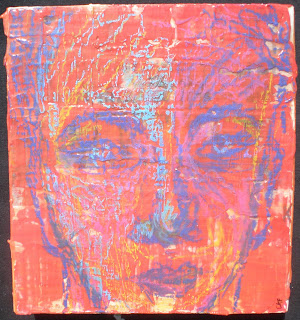
New Painting...

Acrylic on canvas (in progress?)
24" x 24"

Painting (or printing, or drawing...) is hard work. At least for me it is. Especially when I don't begin with a sketch and don't have a definite palette in mind. I started this painting on Thursday night and spent most of Friday and yesterday working on it. There must be at least 10 paintings of varying compositions beneath the surface -- some of them in glorious, deeply saturated colors, and some of them in pastels. (Afterall, this was an attempt to respond to an invitation to participate in Cathy Nichols' Found Art Friday, the theme of which was "Everything Blooming" (as in: spring). The intent of Found Art Friday, by the way, is to do something spontaneously. Well, since Friday came and went, and since my painting became a major project that went decidely autumnal, I did not submit it. However, several on-the-mark pieces, were submitted including Cathy's own, lovely encaustic piece.

Below, is the iteration of my painting that I awoke to yesterday-- before I started playing around with all the colors of the rainbow. The "gray" on the right side was actually white, so you can imagine how intense the yellow/ochre sections of the painting were.


Due to the inordinate amount of time fussing with the painting, I am now behind on my posts. But I hope to have a another post up, featuring the work of a wonderful artist, by Tuesday.

Sunday, February 21, 2010

Erin Spencer's Light-filled Paintings

Image courtesy of Erin Spencer. All rights reserved.

Recently, I came home from a long day at the office to find a very nice and VERY unexpected comment from Erin Spencer, of Painting Dutch Fotos, informing me that she had "nominated" this blog for an award (along with eleven others, per the rules of the award). Truly, I was honored and I am grateful! Erin is a prolific landscape painter bringing her memories of her extended time in Holland to life in her paintings and through her lovely writing. Currently living in Rhode Island, she also captures images of the surrounding countryside, harbors and seashore in her work. Her paintings are, at one and the same time, spare and full of richness -- of color, of light and of atmosphere. Erin's genuine warmth and openess and her enthusiasm for pursuing her art come spilling forth from her blog and I have enjoyed following it very much. Below, is more of Erin's work:


Image courtesy of Erin Spencer. All rights reserved.

Image courtesy of Erin Spencer. All rights reserved.

So very beautiful! .... Well, since receiving notification of the award from Erin, I have visited the blogs of all her other nominees and have gone up and down the "award chain" discovering many wonderful artists' blogs and websites. The intent of the award is to spread goodwill far and wide and to increase exposure for artists. However, I have this slight dilemma of not wanting to exclude anyone in the process of selecting additional nominees for the award! On the other hand, for some time now, I have been wanting to call attention to the talented artists who are following my blog, as well as to other artists that I am discovering. So, in the spirit of the blog award (while not abiding by the rules), that is how I have chosen to spread the goodness. I'll feature another artist in a few days. In the meantime, I encourage you to spend time perusing Erin's blog and shop, and also to check out the blogs of the other artists she nominated.

Saturday, February 20, 2010

Catherine Freshley on Etsy

5 1/2" x 5 1/2"
Mixed media on wood
Image courtesy of Catherine Freshley. All rights reserved.

I mentioned previously that my daughter was working on some new works using a new-to-her process. Well, she has finished several pieces and has uploaded images of them to her brand new Etsy shop. Hooray! (Yes, I know -- I "opened" my Etsy shop last July and still have not "stocked" it with ANYTHING! But if you're interested, you'll find a listing of some of my favorite sellers there. :) ) In case you missed my earlier post about Catherine, you can find a couple of images of her recent paintings on canvas in my January 17 post.

Hope everyone is having a wonderful weekend!

Friday, February 19, 2010

Sunspots, Swiss Cheese Planets and Leaves

"Sunspots"
5" x 7"
Mixed Media
Here is an image that evokes the glorious day we are having in Portland. (Ah, the ease of stepping outside without a jacket!) It was painted and printed on a very fibrous, soft paper with acrylics and inks. The spots across the sun were done with a gold ink which, of course, is very nice on the original piece. Likewise, the painting below, done on mat board, incorporates metallic gold acryllic paint that appears as a flat color when scanned.


Cropped from 8" x 10" painting


4" x 4"
Relief printing and acrylic paint on re-purposed paper

By the way, I apologize if you happened to go looking for my earlier post today. It somehow got away from me and published itself. Fact is, I wasn't very happy with the photo of the painting so I deleted the post. :)

Sunday, February 14, 2010

Relief Prints in Adobe

Well, I haven't had any time to spend in the studio this weekend but I did manage to spend an hour scanning some of my recent monoprints. I was curious to see what kind of patterns I could come up with in Adobe Illustrator and I thought you might like to see the results.


I think these first two have the feel of textiles from Hawaii or other Pacific Islands.
This last one feels more Oriental to me. Your thoughts? I've enjoyed working in this palette, but I'm thinking it's time to move away from it now. So before I print again, I will have to get some white ink so that I can create some spring pastels. I'm looking forward to seeing what everyone has been working on; whether it be new art, or simply a new post, it's all very motivating to me!

Friday, February 12, 2010

An Apple Heart and a Relief Print

8" x 11 "
Here is an "apple heart" that I painted with acrylics on cardstock a few years ago.
Approx. 8" x 10"
And here is another print from last week-end.
Happy Valentine's Day!

Monday, February 8, 2010

Printing on Herringbone and Forcing Quince


While the east coast is buried in snow, the Pacific Northwest is running ahead of schedule as far as spring is concerned. So much so, that the quince in our yard bloomed simultaneously with prunings from the bush that I had brought inside a week ago. But the color of the inside blooms is significantly paler than those on the bush -- almost like apple blossoms (closer to the color in the second photo). Very lovely.

Oh, and by the way: mystery solved! The bush with the beautiful yellow--and very fragrant, I might add--blossoms is called "Edgeworthia." The name was supplied by Lesley, who lives in the UK and has the very interesting and fun blog, Printed Material , which I was delighted to discover via her comment on the mystery plant.


Well, Lotta (of wonderful Inleaf) who is a relief printer extraordinaire and a wonderful textile artist, requested photos of my weekend efforts on fabric. So here are a couple from my experiment on a warm grey and black herringbone weave. Between the design and the fabric, I think they feel quite contemporary.


Sunday, February 7, 2010

New Work...Hand-pulled Prints

5" x 7"
As promised....finally, some new work! I was able to hand pull about 25 prints and also did some relief printing on fabric. (Maybe I'll take a couple photos of that work and post them.) So here are a few of the results. I used Speedball and Versatex inks and the prints combine hand-cut paper stencils, an EZ-cut block, and drawing.


5" x 7"
While I love the boldness of "full-on" color, I also love the softness and mystery of the "ghost" prints, below.

5" x 7"


7" x 10 1/2"

It feels great to have spent so much time in the "studio!" Now -- it's back to business. As always...thanks for your interest!